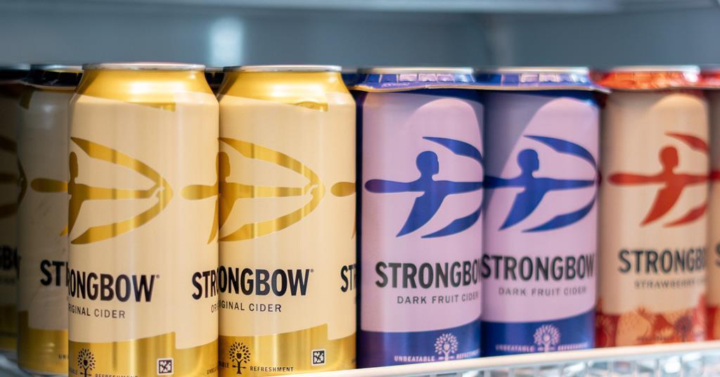
Strongbow Fused Navilens Codes into its Packaging

Image Credits: PACKNODE
Announcement
Innovation in beverage branding emphasizes limited edition packaging and catchy campaigns, or else collaboration with popular influencers. But Strongbow, the UKs known cider brand, has raised the standard by leaving both commercializing tactics behind. Strongbow is now the first ever company to merge Navilens codes into its packaging. Navilens is a guide technology introduced to help the visually impaired and the blind. Its different from traditional QR codes that ask for accurate alignment. Navilens code is scannable from a distance (almost at various meters) without any need for a camera to focus directly. After scanning, they provide product details like AV, specific drinking guidelines and ingredients, and other important information that is difficult for these groups to access.
Collaborating with the first disability-aimed marketing agency, purple goat strongbow organized a research session with the visually impaired and blind creators to rephrase its strategic planning on offering excellent reconstruction to its packaging structure that will be helpful for the blind community. The result rebuilds advanced branding as a deep value rather than just a compliance box.
Strongbow’s impressive and bold decision
From a brands design angle, Strongbows decision demonstrates a push that was worth the wait in the industry. The push towards brand equity and usability is imperative. By integrating accessibility into a cider label, the brand indicates to customers its way to experience that everyone can also be part of. Under the branding terms, this is a robust factor. This makes Strongbow more relevant to mainly disabled audiences, also attractive among the younger consumers who look up to brands taking valuable stands. Accessibility is not niche; its a sign of responsibility and modernity.
Packaging is likely stressed over storytelling, and reaching the audiences beyond just being a container. But Strongbow elaborated on packaging as an interface. With the Navilens idea, the physical product will easily connect to digital experience and information, expanding its presence of design both aesthetically and empowering. Dom Hyams of purple goat commented, “The true brand strength builds from the consumer needs understanding. Strongbows approach of navilens focuses on how a brilliant design can shift from a supermarket or transport system into a categorized dropdown that hardly prioritizes accessibility, such as alcohol.”
Strongbow’s cider brand director, Rachel Holms, said,
“It wasn’t only about adding a QR code. Considering views from visually impaired and blind creators helped us address the need that we didn’t notice, and that input has framed something far more valuable.”
Top Stories
- A Simple Guide to Understanding Benefits of Rigid Boxes
- A Packaging Guide for Artisanal and Handmade Product Brand
- UFLEX Expands PET Recyclable Woven Polypropylene Food Packaging to Mexico
- Tetra Pak Launches India’s First Carton Packaging with Certified Recycled Polymers
- PepsiCo Reinforces pep+ Strategy with Sustainable Packaging Goals
